The Whitney Sails West
John Haberin New York City
The New Whitney Museum
America Is Hard to See
"America Is Hard to See." So the Whitney calls the inaugural exhibition in its 2015 new home in New York's Meatpacking District, but take heart: it gets easier and more rewarding once you come closer and start looking.
One could say much the same about the new building, designed by Renzo Piano. Monstrous as one approaches from the north, half-hidden from the east by the High Line, it nonetheless became part of the life of the street even before its public opening. 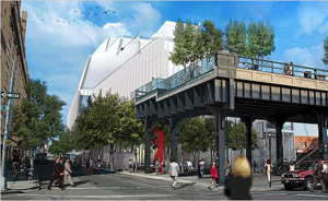 The welcome extends inside, too, where the lobby gallery will remain free to all. The museum will also stay open till 10 three nights a week for the length of that inaugural exhibition, drawn entirely from the permanent collection. And sure, that exhibition deserves your close attention, for its attempt to see a diverse and often divided America. First, though, all eyes will surely be on the museum's architecture and its future.
Family censure
America Is Hard to See. The line draws on a late poem by Robert Frost, who traces the difficulty all the way back to Christopher Columbus:
Remember he had made the test
Finding the East by sailing West.
But had he found it? Here he was
Without one trinket from Ormuz
To save the Queen from family censure
For her investment in his venture.
And now the Whitney has sailed west, to the very edge of Manhattan, at a cost of $422 million and with a capital campaign of nearly twice that.
From the very moment it set sail, too, art's extended family was near to censure. What would happen to its architecture on Madison Avenue, and what ever could match it? The museum itself raised the question barely a year before its closing, recreating a 1977 installation by Robert Irwin that reduced one floor to its luminous interior. Initial plans called for its retaining a footprint near Museum Mile by sharing the space with the Met. Jerry Saltz even urged relegating the new building to contemporary art, as if to keep up with the latest trends in clothing stores and restaurants north of Greenwich Village. At present, the Met will have the old building to itself as the Met Breuer, on an eight-year lease—perhaps with murals by Thomas Hart Benton once destined for the Whitney.
Censure only grew after the groundbreaking in May 2011, as Piano's eight-story architecture took imposing shape. The view from the north quickly went viral, earning comparisons to a hospital or prison. From the foot of the High Line, one has only a slab that one can touch but not enter. From the west, its stacked boxes lack even the coherence of the New Museum on the Bowery. Speaking of sailing, it takes a more horizontal shape along Ganesvoort Street, where one enters, like a luxury liner run aground. It recalls Frost's harsh judgment of Columbus:
But all he did was spread the room
Of our enacting out the doom
Of being in each other's way,
And so put off the weary day
When we would have to put our mind
On how to crowd but still be kind.
These things matter, because they touch on access—and on whether American art will be hard to see. The building helps create an extended arts district connecting Chelsea to the south, at a healthy remove from the subway, and indeed it takes over space that the Dia Foundation once considered. Yet it comes into full view only across West Street, perhaps from a future park designed by Thomas Heatherwick. Its institutional look picks up on the site's industrial roots, right down to a row of ventilation ducts on the roof, but without the wit or transparency of Irwin's own architecture for Dia:Beacon or Piano's for the Pompidou Center. Maybe the interior can still shine, for maybe form no longer follows function, but they do impinge on one another. When they try to stay apart, and the exterior is only a skin, they are often reviled as Postmodernism.
From the very first, though, the Whitney's plans also held a liberating promise, much as for a problematic expansion at the Philadelphia Museum of Art. It gains twice the space, including its first theater and education department. It gains offices on the building's north side and spacious on-site quarters for conservators. Better yet, it can do all that without encroaching on old neighbors. It had first proposed demolishing Upper East Side brownstones and handing over the Marcel Breuer classic to an actual postmodernist, Michael Graves. Thanks to its current director, Adam Weinberg, no more.
The new Whitney may loom apart, but it has a determination to become more open and easier to see. It treats the lobby (with its Danny Meyer restaurant) as part of a larger public space outside, with a sheltering cantilever overhead. It places art on a façade across the street facing the High Line, starting with a boisterous painting by Michele Abeles. It signaled its welcome, too, with a preview reserved for artists in its collection. Unlike MoMA with its condo tower, the Whitney also resists treating expansion as a real-estate venture. Last, it chose an architect known for museums—which brings one at last to the design.
To crowd but still be kind
So which will it be, an eyesore or an eye-opener? How about both? One can already strain for good news in its towering windows as seen from the northeast. Mostly, though, one just has to accept the bad news and to enter. Unlike at the Morgan Library, Piano skips the fashionable waste of space for a museum atrium. As with the Menil Collection in Houston or the forthcoming Lenfest Center for the Arts at Columbia University, he seeks instead space for art in relationship to its surroundings—to crowd but still be kind.
Piano was a safe choice, and safe is not exactly a compliment, for good reason. Still, he delivers thoughtful reminders of Madison Avenue. Like Breuer, he relies on movable walls and high, gridded ceilings to accommodate varied displays of art. Elevators open directly onto the galleries. (Richard Artschwager supplies fake wood veneer and mirrors, which make the galleries appear to wrap around the elevator bank.) And where Breuer's trapezoidal windows and recessed lighting provide a singular balance of natural and artificial light, Piano opens things all the more.
 Central stairs, winding around ropes of lights by Félix González-Torres, run to the fifth floor, where the main galleries begin. Ultimately the eighth and fifth floors will hold temporary exhibitions, with the permanent collection between them. That means half the space, a pointed contrast with MoMA's neglect of its collection in favor of crowd control and spectacle. If one starts at the top, beside a coffee shop, they become progressively larger as one descends, to the point that a cigarette butt by Claes Oldenburg can slip out of its pretend ashtray and halfway across the room. Glorified fire stairs connect these floors, a weakness as at the New Museum, but one has another option in good weather: each floor has a terrace, with more stairs outside.
The terraces serve for sculpture—with one right now for David Smith and one for Tony Smith and Minimalism. (Not that anyone ever used Breuer's idea of a sculpture garden, the moat-like basement exterior.) Just as much, though, they hold sweeping views of the city, from landmarks to an adjacent water tower. The largest terrace has colorful chairs by Mary Heilmann, in case one wants to relax and enjoy the scene, beneath video of the neighborhood and additional geometry in hot pink. Seen from above, her installation blends into the High Line a floor below. This museum is not all that open to the city from without, but it is from within.
The galleries share that openness. Some face out, like a wall now for Jonathan Borofsky and the silhouette of his Running Man, but others do implicitly, because partitions never erase the feeling of vast uninterrupted galleries. Will it work? Will it allow intimate and extended encounters with a work of art, in galleries that integrate photography and prints, not always to their advantage? Does it help to hang walls Salon style, with labels on hand-held cards, amid rooms for larger work, and will brighter lighting wash out subtleties—as I could swear befalls a black square by Ad Reinhardt? The opening exhibition mostly looks great, but the real test lies in the months to come.
America is hard to see.
Less partial witnesses than he
In book on book have testified
They could not see it from outside—
Or inside either for that matter.
We know the literary chatter.
Critical chatter gushed over the New Museum and MoMA's expansion, when it should have known better, and once again the uncritical chorus has begun. While I got those right, they should teach me to resist the temptation to gush this time, at least before the first major loan shows, of Archibald Motley and Frank Stella. I feel it, but for now I shall leave the experience to time and to you.
What about the wherewithal?
America Is Hard to See. The Whitney is pondering its very mission, as a museum of American art in an increasingly global art scene. And it answers with welcome attention not just to its collection, but also to a context in the museum's history and America. While a 2006 exhibition looked within, on the occasion of the Whitney's seventy-fifth birthday, this one starts in the lobby gallery with its origins on West 8th Street, where Gertrude Vanderbilt Whitney had every reason to demand a showcase for American art: the Met had refused the gift of her collection. It moved to 54th Street in 1954 and uptown in 1966, but the Whitney would like you to think of its latest move as a homecoming.
Not only does it care about its collection, but also about criticism that museums, most especially the Museum of Modern Art, are bastions of white male privilege. If you fail to recognize something, there is a good bet that it will be by a woman—starting with Whitney herself, a sculptor. Elsie Driggs has her sooty Pittsburgh just as Charles Sheeler has his industrial Detroit, Ilse Berg her smokestacks by the Queensboro Bridge just as Joseph Stella has his Brooklyn Bridge, Agnes Pelton and Irene Rice Pereira their place between abstraction and the imagination just like Georgia O'Keeffe, O'Keeffe drawings, and Stuart Davis, with a Davis retrospective coming up, and Margaret Bourke-White her unflinching photography just like Edward Steichen. The list continues, but suffice it to say that it in no way reduces the display's quality and interest. Hedda Sterne, the sole woman in a notorious photograph of Abstract Expressionists, does not stand out all that much, but her airbrushed enamel resonates with the casual mixed media of abstraction today. Besides, that room also has space for Lee Krasner, Norman Lewis, and Alfonso Ossorio.
As that example suggests, the diversity extends pointedly to African Americans and others. Bill Traylor and Charles White challenge Benton's view of America's heartland, Al Loving the free-floating anxiety of American Surrealism. As for globalization, the Whitney gave its very first retrospective of a living artist to Yasuo Kuniyoshi, a Japanese American. The museum wants its history to be the story of America. Its six hundred works proceed chronologically, but in "chapters" named for art like Sterne's New York, N.Y. and Loving's Rational Irrational. And the implicit message of those chapters is almost invariably political. 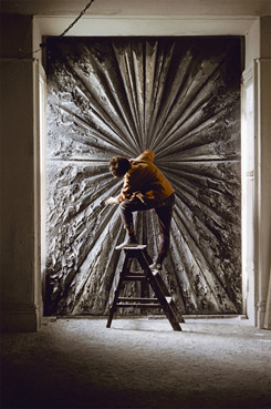
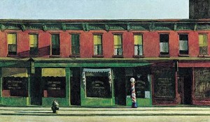
They see Stella and others as drawing on not just European Modernism, but the city. They see familiar highlights in the very contexts from which they so often diverged—such as Early Sunday Morning by Edward Hopper within Surrealism, The Artist and His Mother by Arshile Gorky within the realism of America's heartland, or Three Flags by Jasper Johns within Pop Art. They see Minimalism, starting with Eva Hesse, as consumed not just with geometry, but also the body. They see Pop Art and Minimalism alongside responses to the Vietnam War, and in fact Emil De Antonio borrowed Frost's title for a documentary about Eugene McCarthy and the antiwar movement. So what comes on the final floor, after the 1960s? New Image painting, sure, and Chuck Close, but mostly continuing crises.
The show targets race from the start, but come the end Negro Sunshine in neon by Glenn Ligon also faces the High Line. Gender identity comes early, too, with Marsden Hartley off the top floor's elevators. And then the final floor's elevators open to a David Salle nude and We Don't Need Another Hero by Barbara Kruger layered over Donald Moffett's wallpaper blaming Ronald Reagan for the toll from AIDS. A leg by Robert Gober rests near Robert Mapplethorpe in his self-portrait with a death head and Nan Goldin with The Ballad of Sexual Dependency. Finally comes art after 9/11, like video of falling shadows by Paul Chan. And with that, the Whitney's self-portrait comes to a screeching halt.
Its history does not descend to a lecture, but it maintains a respectful distance, as if stuck in the Whitney of the 1990s, of Fred Wilson and Charles Ray—those mannequins that were supposed to tell you something racy about racism and child sexuality. Abstract Expressionism looks great, but it quits before color-field painting apart from Joan Mitchell, much less painting today. The Rose by Jay DeFeo, a dark cavity of torn canvas by Lee Bontecou, and a wall by Louise Bourgeois make an impressive corner. Still, would they want their work to look anything other than larger than life and utterly obsessive? To quote Frost again, "But what about the wherewithal?" Perhaps American art really is hard to see.

"America Is Hard to See" and Mary Heilmann's "Sunset" ran at The Whitney Museum of American Art through September 27, 2015. The museum opened May 1, 2015. Related articles consider the Whitney's initial plans at the time, a gallery retrospective of Renzo Piano, a critique of museum expansions, and a rehanging of the Whitney's collection in 2019. A 2022 exhibition rehangs early modern art with an emphasis on diversity, as "At the Dawn of a New Age."
