Nudging and Shaping
John Haberin New York City
Joan Snyder and Elizabeth Murray
Some artists leave their mark within a tradition. Others oblige art to begin anew.
Joan Snyder and Elizabeth Murray did both. They continued painting when others had declared it dead. They took the painted mark as critics then liked to describe it—as a formal sign in a strange language or as a continuation of the frame. Yet they gave it the immediacy of a memento or a cartoon. They suffered for that twist, too. Who cared for a woman's private memories or a culture's childish ones, when formalism and irony alike just had to announce art's self-importance? 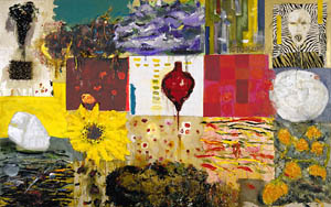
Now their sense of play and their personal touch look downright prescient. Their retrospectives suggest how women have suffered and escaped the stereotype of the minor artist, by playing the old game with their own, looser rules. In the end, Snyder nudged painting ahead, but Murray literally and figuratively shaped it. For further clues, gallery surveys of her in the 1970s and 1980s throw in her last completed work before her death in 2007.
Essentialism and inconsistency
Did Postmodernism mark a break? Did it shatter the formal object or extend a century of critique? Did it ridicule Modernism or keep its strategies alive? Did it begin with East Village art—or a decade earlier when Jennifer Bartlett disassembled painting into wall tiles? Did it drive art toward popular culture, or did it allow one to see the chaos that was already there? Maybe all of the above, and Joan Snyder thrives on that postmodern paradox.
Snyder's retrospective holds barely thirty works. Any one of them could serve as a turning point. She gained attention around 1970, when abstraction flourished. She worked within a grid, like the color charts of Josef Albers, or with brushstrokes separated by horizontal rules and bare canvas. Often she recapitulates signature styles of the recent past, from a loaded brush for Willem de Kooning to the restrained geometry of Ellsworth Kelly. They reflect on painting, with wonder.
She is also trying things on for size, comfortable in her subjectivity and uncomfortable with logical rules. The color charts include unfinished squares. Where formalism sees the painted image as an object, Snyder treats the art object as a multiplicity of images.
A teacher herself, Snyder uses painting as a notebook—incorporating simple text and images as familiar as hearts and flowers. She introduces landscape as well, not unlike Joan Mitchell. Colors gain in contrast through the 1980s and 1990s, and both words and images grow more serious. They include refugees, AIDS suffers, and entire verses of Romantic poetry. She cares about politics, and her former husband, Larry Fink, was a social photographer.
Snyder has boasted that she predated Neo-Expressionism. And her work remains an ongoing catalog of herself as a painter and a woman. Her sensual brushstrokes serve as extensions of her body as well as mind. For a short time she tears and reweaves canvas like flesh as well. The transitions in her career correspond roughly to changes in her personal life at that. She moved away from New York with Fink and then back, but as a single mother and the partner of another woman.
The Jewish Museum tries hard to overlook the gaps in her output and her tenuous relationship to Judaism. It quotes her as comparing art to an altar, and it speaks of her sign language as Jungian, enough to make Jackson Pollock fans tremble. Still, one does not have to look deep into the unconscious for those bleeding, telltale hearts. For her, as for art today, anything goes. And that anything can bridge abstraction, realism, and politics.
Hello, cruel world!
Elizabeth Murray, too, came late to formalism and early to Neo-Expressionism or Neo-Pop. Who, though, can accuse her of inconsistency, when she has pushed the logic of the frame for twenty-five years? She makes motifs from Frank Stella, Edvard Munch, Munch prints, and Walt Disney her own. And she uncovers inconsistencies in each. It makes her retrospective a great end to the first year of MoMA's expansion.
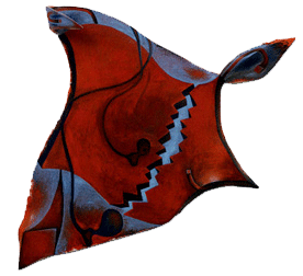 Murray in the early 1980s embraced both abstraction and shaped canvas, but she gave them a shape all her own. Stella's Protractors and Mitered Mazes build on the regularity of a stretcher. His self-reflexivity extends, too, to primary colors out of Abstract Expressionism and enamel out of a hardware store. Murray wields her shapes freehand, and she dares one to keep track of how they come together.
At the same time, her work suggests a commitment to the past. That includes sheer skill, although she delegated a frame's construction to her studio. A furniture maker would take pride in curves like these. An older painter would admire her blended surfaces and hints of human anatomy. Like Cubism, she supplies multiple cues to space as well, from the cracked surface to overlapping planes. A dark tentacle, like a small head from Munch's Scream, looks back to Surrealism, but through the eyes of a knowing child.
Take Don't Be Cruel, from around 1985. Sky blues trace the upper edge, which puckers at one corner and twists on itself at another, while black emphasizes the left and right edges of the curved canvas. The same tones emphasize an apparent jagged break down the center, which also supplies the near vertical that the canvas itself cannot. Meanwhile, an earthy red tapers into spirals that pick up the overall shape. One can see the result as sculpture, but it succeeds as a new model for painting.
That central jagged edge also evokes teeth from a human being or a machine—perhaps the machine that created the art. Hello, cruel world! Stella got the point. His later work moves closer to sculpture. He also adopts more figurative elements and narrative titles. He may draw them from literature rather than from Elvis, but then he did receive a Princeton education.
Her breakthrough comes with a rectangle, but it hardly ends there. Her curves push against the edge, rather than coincide with it. Later paintings complicate or even reverse the formula. Don't Be Cruel, for one, allows rectilinear elements to intrude upon the curve. Talk about squaring the circle. Yet she kept to the glorious logic or illogic of unframed canvas even as Stella himself was growing fussier in metal.
"Gasp!"
Rather than shaped canvas, one might speak of the shards of one or the assemblage of many. Like Robert Rauschenberg in his combine paintings, she also incorporates ordinary objects. The gap in one painting mimics a keyhole, leaving the viewer to find the key. Euclid could pass for a pitch-and-toss game. Contrasting colors smear into one another, creating new openings for brightness and darkness.
Murray welcomes illusion, but as a further reflection on painting. The teeth breaking apart Don't Be Cruel do not exist, and neither do the shadows that seem so natural for one canvas projecting out over another. A cartoon head anticipates Jonathan Borofsky, and it looks undeniably cute. Yikes, from 1982, outlines a shattered teacup, but the tea still lets off steam. The curved divisions in some later work mesh like jigsaw puzzles, while the image often resembles a biological cell.
Her circling back includes the literal layering of canvas, in twists that recall waves or Möbius strips. One work from the 1980s has four pieces, each propped at one end on the next, like M. C. Escher's eternal waterfall. Other pieces stand just apart, leaving it to the viewer to decide whether the canvas is coming together or apart. When she returns to earlier motifs, she is still taking stock. One can describe her career as the alternation of continuity and disruption. Just try to tell them apart.
The warped edges of Don't Be Cruel or Sleep suggest floating as well as tearing, as in a dream. Yet the dream elements give way in time to images with everything on the surface. Colors brighten, and pop culture references multiply. Is Murray the last woman Pop artist? Her best paintings take the canvas literally but not too literally. They accept that art has trouble taking anything literally nowadays.
The first shaped canvases have a scale, creepiness, and beauty that stand out compared to the fussiness of her paintings from the early 1970s and of her later work as well. They take soft edges and craft and dare one to call them woman's work. They belong to their time while nudge art toward its present-day mess. One can no longer dismiss her career as a cute aside or as painting's last gasp. At the very least, that gasp requires a thought balloon and an exclamation point.
If all that makes Murray a figure of her time, it also makes her a disturbing force. Where Stella or Judy Pfaff announces a break, she assimilates everything. Where Stella treats even the wildest turns as predetermined, she always finds one too many determinant. Where Stella's time marches on, her images and shapes keep circling back. Was she the best painter of her generation? Like Jasper Johns or Gerhard Richter and Richter's late work, she makes it hard to define what one means by a painter any longer, but even harder not to care.
When formalism broke up
Sometimes, it helps to break for a beer. As two smaller shows make clear, the 1970s started with just that, although the 1980s are more her cup of tea. A brown still life from the early 1970s has the thick, musty surface of someone stuck in art school. It can hardly decide whether to take on the Old Masters, Abstract Expressionism, or Cubism—only the long-stemmed glass holds beer. Murray may be struggling, as she said, with Juan Gris, but on her own terms. And the glass is about to spill over.
That spill kept plenty of artists going through years of hearing that painting is dead. For her, painting never died. It just shattered into shards of color. Like Brice Marden, she deserves credit for the hope that if she got others worrying, too, they might start to enjoy it. The two halves of Breaking could never quite fit together, but painters got the (continental) drift.
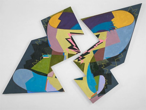 By 1972 Murray was learning when to break up. She confronts the geometric abstraction so dominant at the time, with a single curve or deliberately inexact triangle against a rough and splattered ground. Perhaps the harsh yellows of Golden Delicious still feel muted, and the expressionist handling looks to the past. Nothing suggests an artist worth remembering, but change is coming. A figure eight opens up the collision between two and three dimensions, although cautiously, and a diagonal cuts through a big square. When a huge dark bubble pushes up against the edges in 1976, the ground has become figure, and canvas has reached the breaking point.
From there to Breaking, the canvas stays perfectly intact, but you may have to look twice to believe it. That early diagonal returns with a jagged vengeance, anticipating Henrik Eiben, and so does the tension between its geometry and the brightening color fields. Curves take on the splashy color of Pop Art, the kind that dominates the fragments of her later work. One can almost hear the explosion from a speech balloon by Roy Lichtenstein. Her jokey titles could come out of Pop Art, too. If the previous generation wanted paint to look as good as fresh out of the tube, Murray could be squeezing a toothpaste tube.
She was not alone in her loving rebellion against her roots, but no one quite matched the love or the rebellion. She revives the image, like the New Image painting of Susan Rothenberg, Michael Hurson, Donald Sultan, and Jennifer Bartlett, but never fully apart from the active color fields of abstraction. The biomorphic blobs parallel Lynda Benglis, but she keeps painting, and she never gives up competing with the boys. The zigzags match Frank Stella note for note. Still, she was not all that interested in formal systems for their own sake or for the sake of their inherent contradictions. She never had to worry about the fate of "pure painting," because it was never all that pure.
Still, she was painting. She even allowed herself a look back at her beer glass twice, in the same muddy brown—only with new wiggles growing out of the glass and then the glass on its side spilling its beer. Robert Storr speaks of her "topologies," but she never really gives up on Stella's abandoned dream of flatness. Even with the Möbius strip and the outline of a ladder, the third dimension appears as an allusion or illusion. The paintings break apart in space, but in the space of the gallery. No one painting has the iconicity of Stella's black stripes, but her work has served as not even his could, as an iconic starting point for painting today.

Joan Snyder ran at The Jewish Museum through October 23, 2005, Elizabeth Murray at The Museum of Modern Art through January 9, 2006, and at Pace through April 30, 2011, and January 13, 2018. A related review looks at Elizabeth Murray in works on paper. I single her out in my best of 2017.
